Employee
Training
Institute
As an educational hub for training, ETi is focused on student learning as well as catering to businesses in order to provide comprehensive training for their employees.
In October 2019, our team partnered with ETi on a ten-week project to refresh the outdated website.
contri
bution
role
Team Leader
UI/UX & Graphic Designer
Front-end Developer
responsibilities
Research
UX analysis (flows and personas)
Design (website and logo)
Iterations of the UI
HTML, CSS, JavaScript coding
Liaison between client and team
team
Sardor "Sam" Ziyoev, Front-end Developer
Chad Teichman, Designer
contribution
role
Team Leader
UI/UX & Graphic Designer
Front-end Developer
responsibilities
Research
UX analysis (flows and personas)
Design (website and logo)
Iterations of the UI
HTML, CSS, JavaScript coding
Liaison between client and team
team
Sardor "Sam" Ziyoev, Front-end Developer
Chad Teichman, Designer

challenge
visual experience and intuitive navigation
How might we provide a professional, informative environment where potential clients would be enticed to explore the courses of study and training services via not only clear and concise descriptions but a pleasing visual experience paired with an intuitive, user-friendly navigational path?
research
digging in
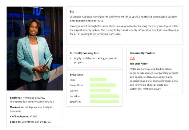
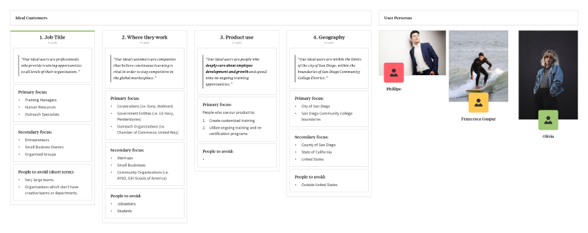
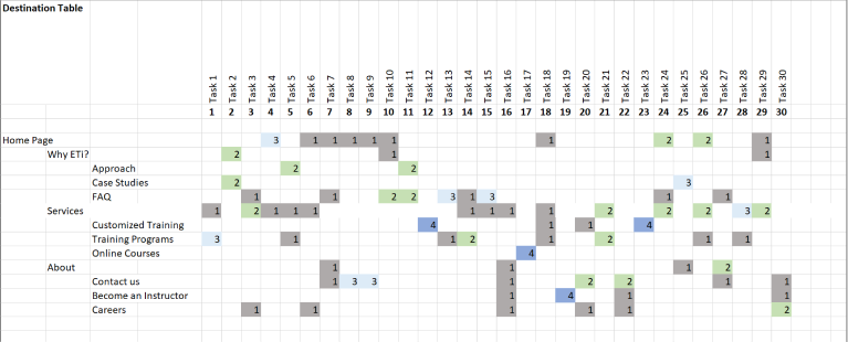
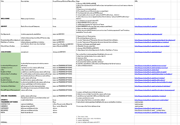
Doing research is a key part of any project, this one was no different - from card sorting to content audit to personas.
problems
solved
less is more
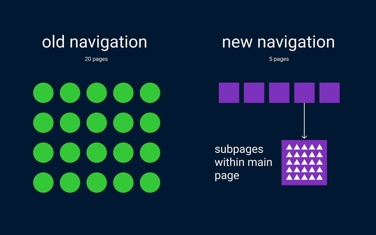
Too many choices cause confusion and make the user feel lost. The time it takes for a user to make a decision increases with the number and complexity of choices.
To avoid overwhelming users with excessive choices, navigation was slimmed down from 20 to 5 main pages thus decreasing the mental interaction cost. Sub-pages are then introduced within the main pages, as at this point the user is exploring from a known place.
remove the distractions
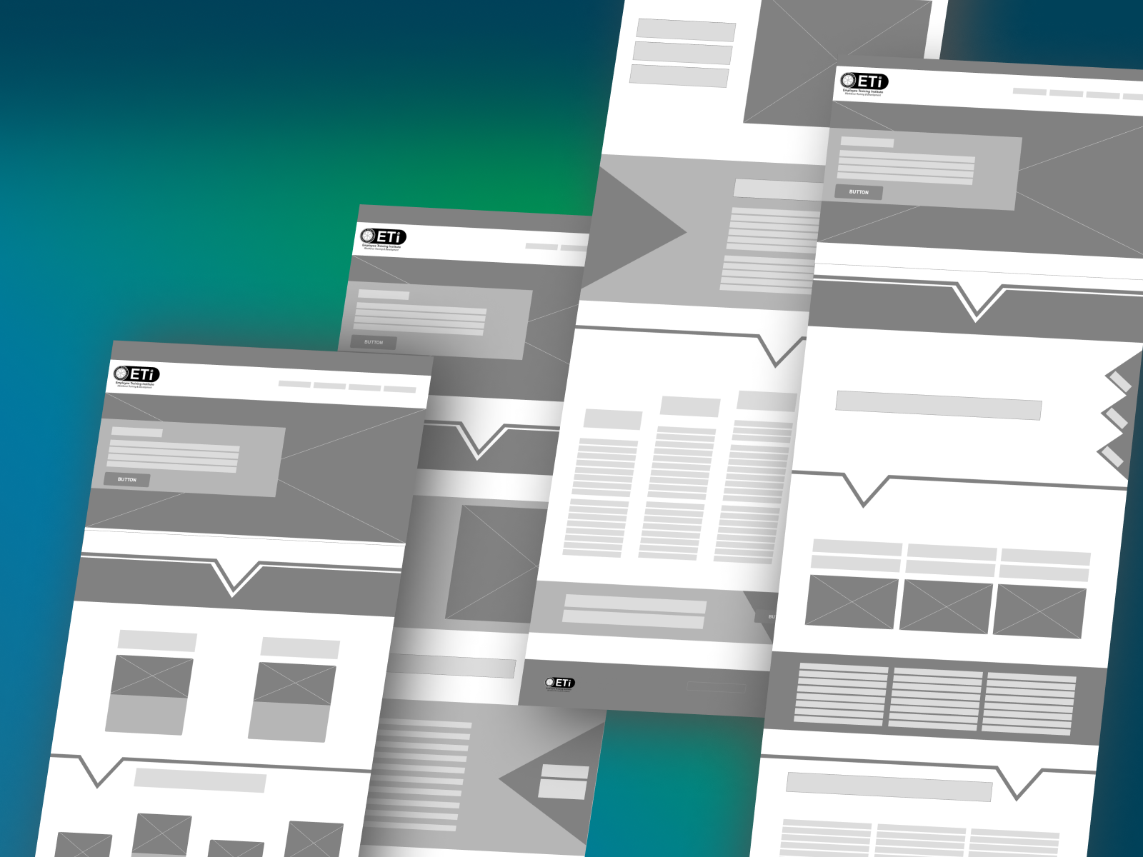
Along the way, user testing found that the original wireframes for the chosen design had a cluttered feel. Though there were design markers (trangles, arrows) guiding the user through the page, user feedback stated it was unneccessary for the experience. By removing the extraneous design elements, the site became cleaner and easier to read.
outcome
step at a time
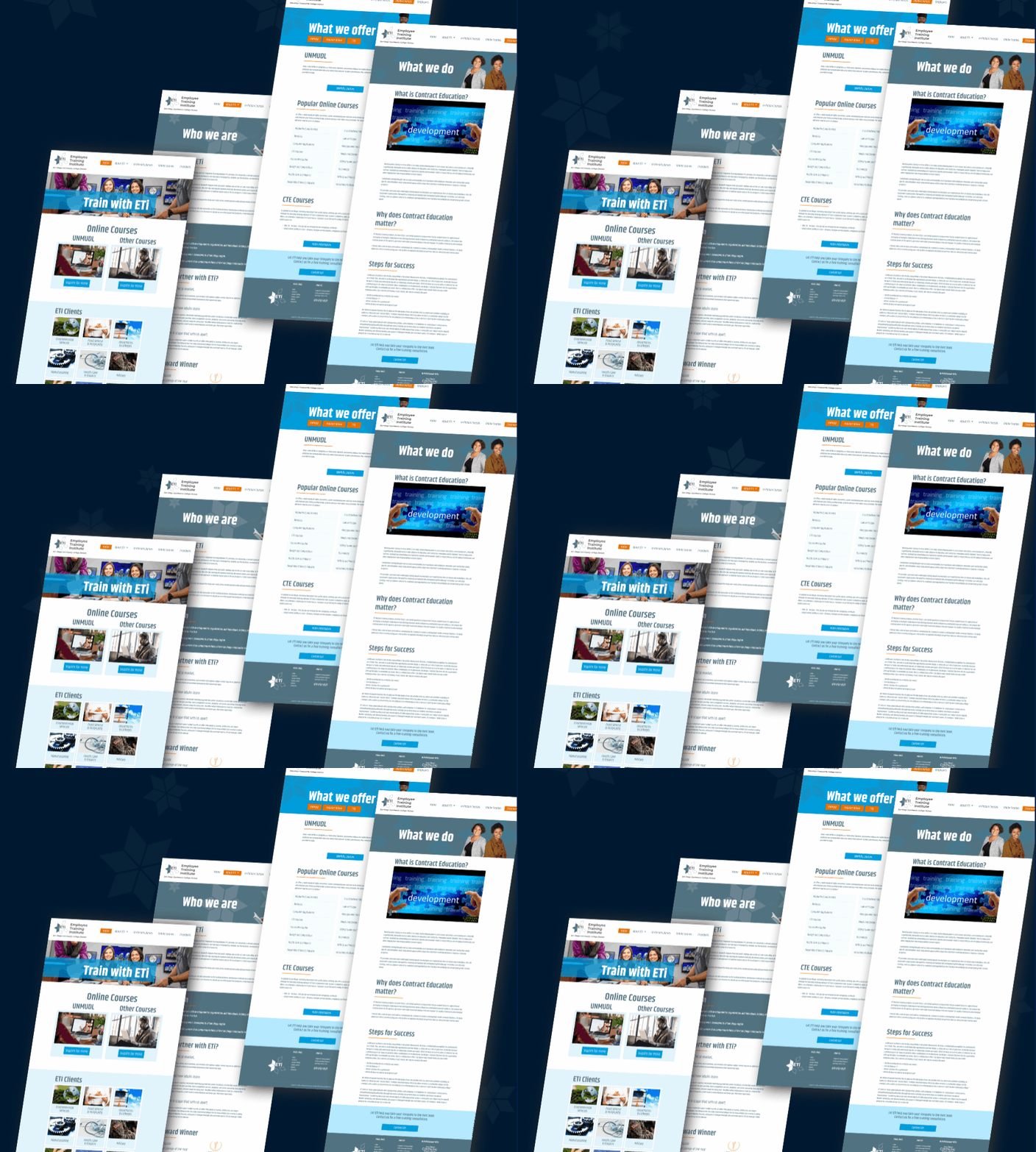
Overhaul of its website was a first step in ETi's business refresh strategy. For now, the site is informational in nature, an introduction to who ETi is, why they are different, and what they offer. With its fresh and engaging content and simplified navigation, the site now serves as a solid stepping stone towards building a connected and loyal customer base.
finale
Fresh and expandable
From understanding who the users were to finding out where the client's most important focus was, we were able to streamline the site. With a solid base, the site can now grow without being overwhelming.
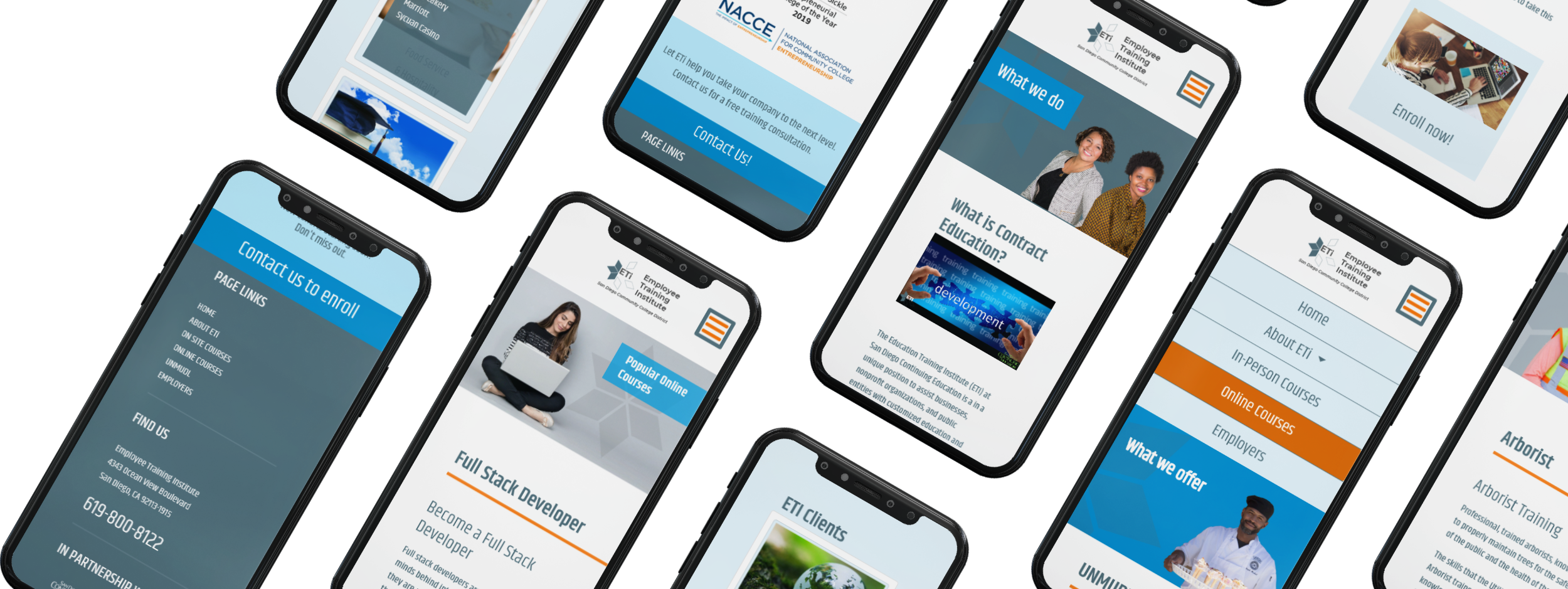
responsive design
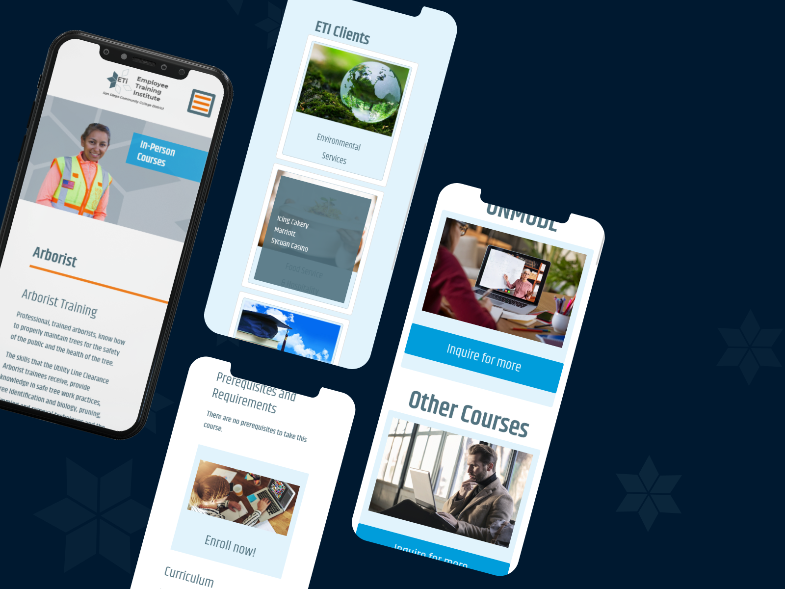
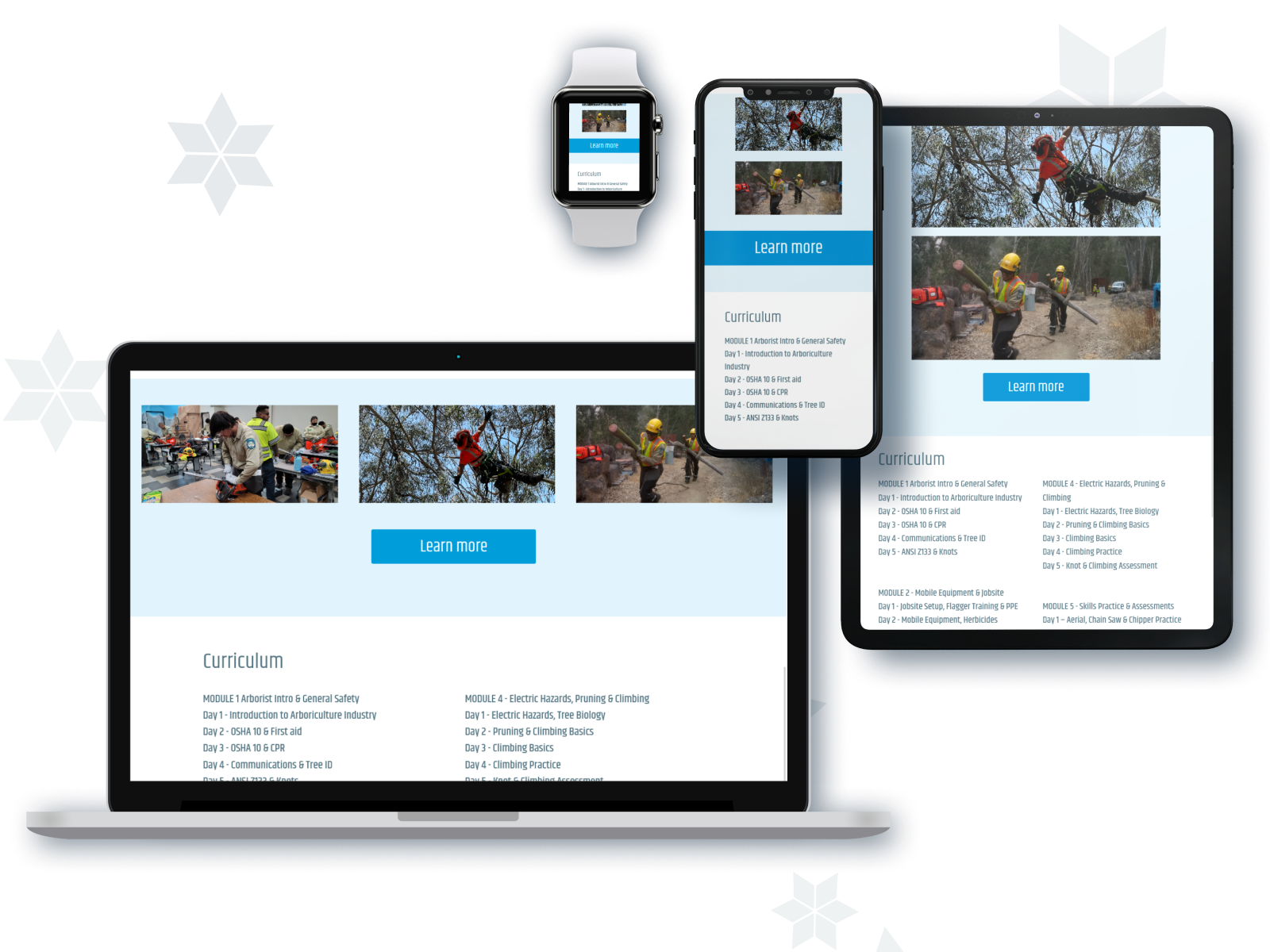
Keeping in step with technological advances by ensuring responsiveness across multiple devices and platforms adds immeasurable value of today's ETi website.
peek at site
*note: In 2022, ETi converted site to Wordpress so original design has since been modified. I did not work on the conversion.

